All about pivot tables part 4: PivotChart
- Nov 1, 2017
- 2 min read

In this last part of my "All about pivot tables" series, I'm going to discuss what are pivot charts.
Pivot charts present data from a PivotTable visually.
“While a PivotChart shows data series, categories, and chart axes the same way a standard chart does, it also gives you interactive filtering controls right on the chart so you can quickly analyse a subset of your data”. - Microsoft Office Support 2017
The main differences between a PivotChart and a standard chart are:

Example
From my "Crime Statistics" data, I want to create a chart that shows the top 10 Council Areas where the most offences occurred.
STEP 1
Insert PivotTable. If you’re not sure how to insert a pivot table you can refer to Part 1 of my "All about pivot tables series here.
STEP 2
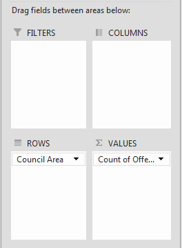
I’ll put “Council Area” into “Rows” and “Offence” into “Values”.

STEP 3
My PivotTable currently shows all Council Areas. However, I just want the top 10.
Click the down arrow next to “Row Labels” > under “Value Filters”, select “Top 10”.

Something will pop-up asking which values would you like to show the top 10. As “Count of Offence” is the only field under “Values”, that’s my only option > Click OK.

The top 10 Council Areas where the most offences occurred are:

STEP 4
To create a pivot chart, I’ll click on the pivot table > under “PivotTable Tools” tab > ANALYZE > under “Tools” > select “PivotChart”.

STEP 5
I have many chart options to choose from. I’m going to choose a bar chart as there are long category names (Council Areas) and by putting it along the vertical axis, it makes it easier to read. Further, seeing as it show’s the top 10 Council Areas, I can adjust it such that it’ll be obvious to the reader which Council is the #1.

STEP 6
I’m going to tidy up the chart by hiding all field buttons, deleting the legend and adding data labels. Notice that my Excel bar chart category is reversed / backwards compared to the pivot table.

To make it the same order as my pivot table:
Click on the Council Areas in the graph (vertical axis) > right-click and select “Format Axis”. A “Format Axis” bar will appear on the right hand side.
Under “Axis Position”, tick the box next to “Categories in reverse order”.

STEP 7
After formatting my chart, it looks like this:

Have a go at replicating the chart here: Crime Statistics
If you've missed any of the previous parts to this series, you can go back here: Part 1, Part 2 & Part 3.
Notes: Categorical data and images of this tutorial are based on the following:
'Pivot' GIF sourced from giphy.com
List of council areas from State Government of Victoria, Victorian Local Councils - http://www.vic.gov.au/government-economy/local-councils/victorian-local-councils.html
List of offences and offence category from Crime Statistics Agency (CSA) - https://www.crimestatistics.vic.gov.au/
All other figures and data are my own and is for illustrative purposes only.


Comments